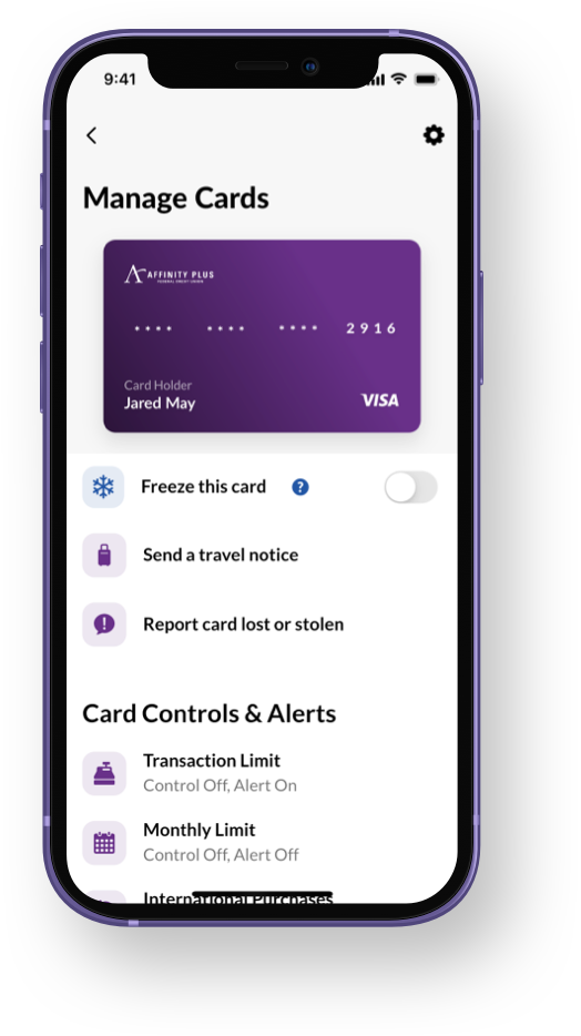
Card Controls and Alerts

My RoleUser Experience Lead
UI Designer
ActivitiesDesign Studio Workshop
Wireframing
Interaction Design
Visual Design
Prototyping
Usability Testing
ToolsMiro
Jira
Sketch
Abstract
Invision
Pencil and paper
Project Overview
Losing your banking card—or worse, having it stolen or compromised—is extremely stressful. Every minute it takes to resolve the situation adds up, and the consequences of being too slow to react can be devastating. At Affinity Plus, this project aimed to empower members to take control of using their cards quickly and confidently. These controls and alerts weren’t just reactive but proactive. I was in charge of implementing the feature set of Card Controls and Alerts to both the native mobile app and the online banking web application.
With the Card Controls and Alerts feature added to digital banking, members could easily monitor their accounts proactively, and the credit union reduced the number of replacement cards issued.
100,000+
Members with active alerts
30%
Reduction in reissued cards
Problem Space
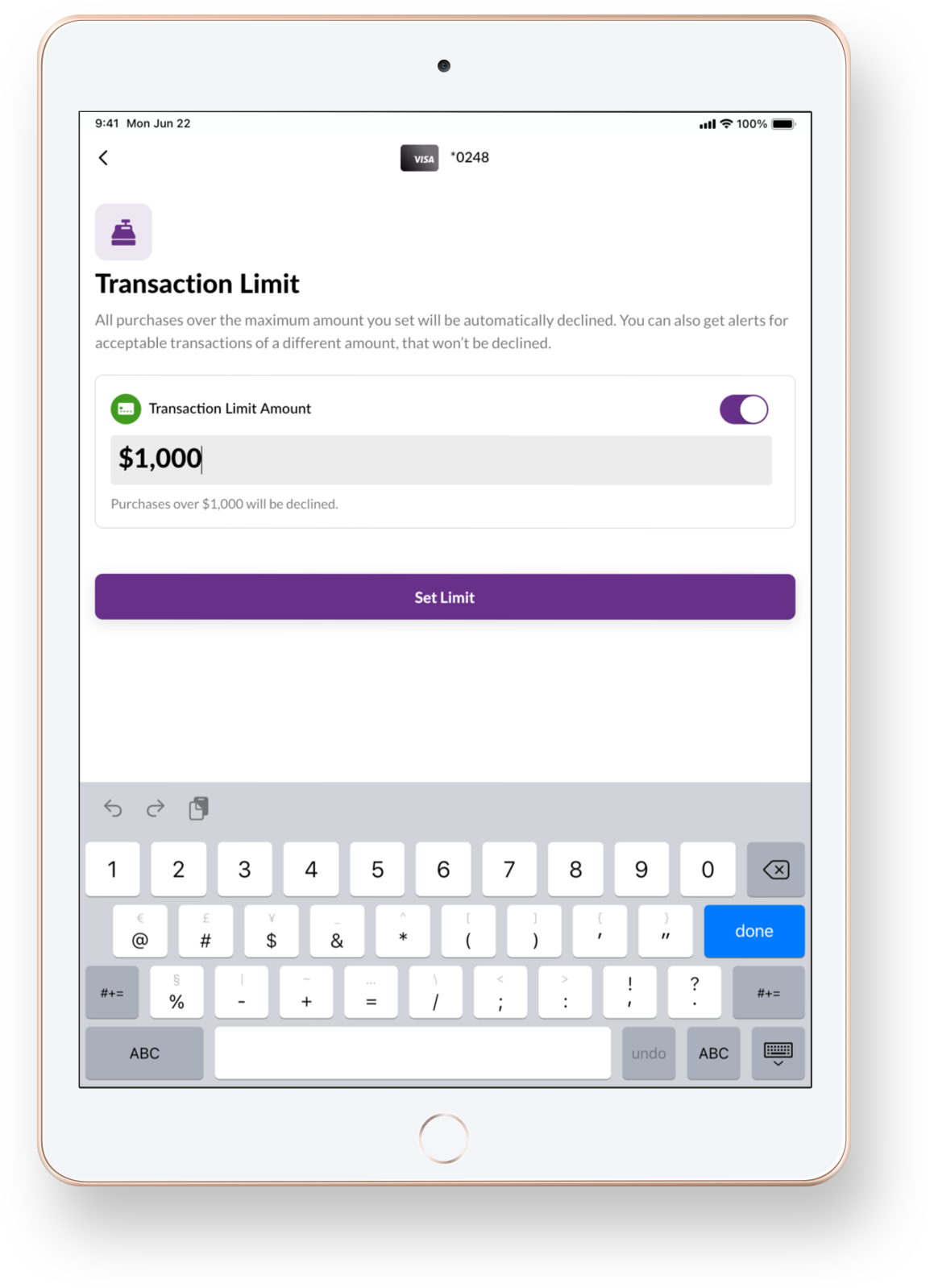
Feedback from our members identified an unmet need: they needed options to manage their debit and credit card security and use. This lack of self-service options resulted in increased support call volume and the issuing of a high volume of new cards. Members couldn’t set restrictions on transaction types or spending limits. There wasn’t a system to notify members if their card was compromised and used to make a fraudulent or unapproved transaction.
The Situation
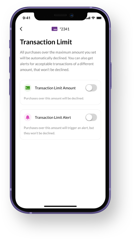
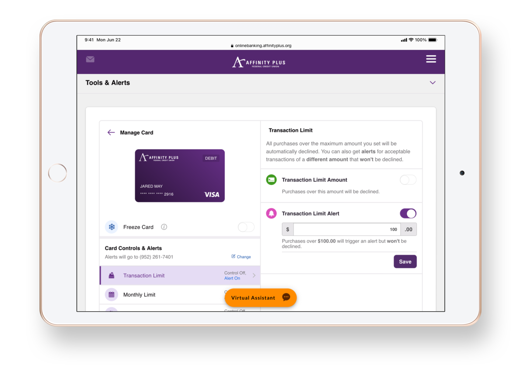
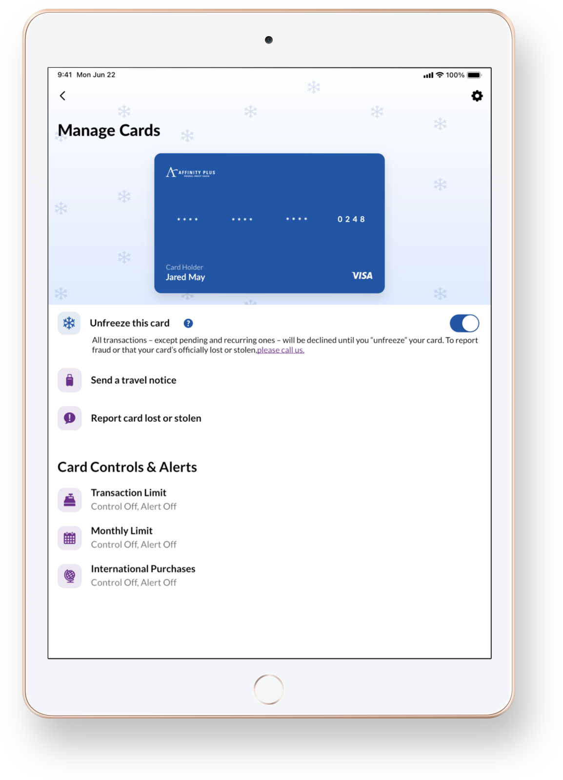
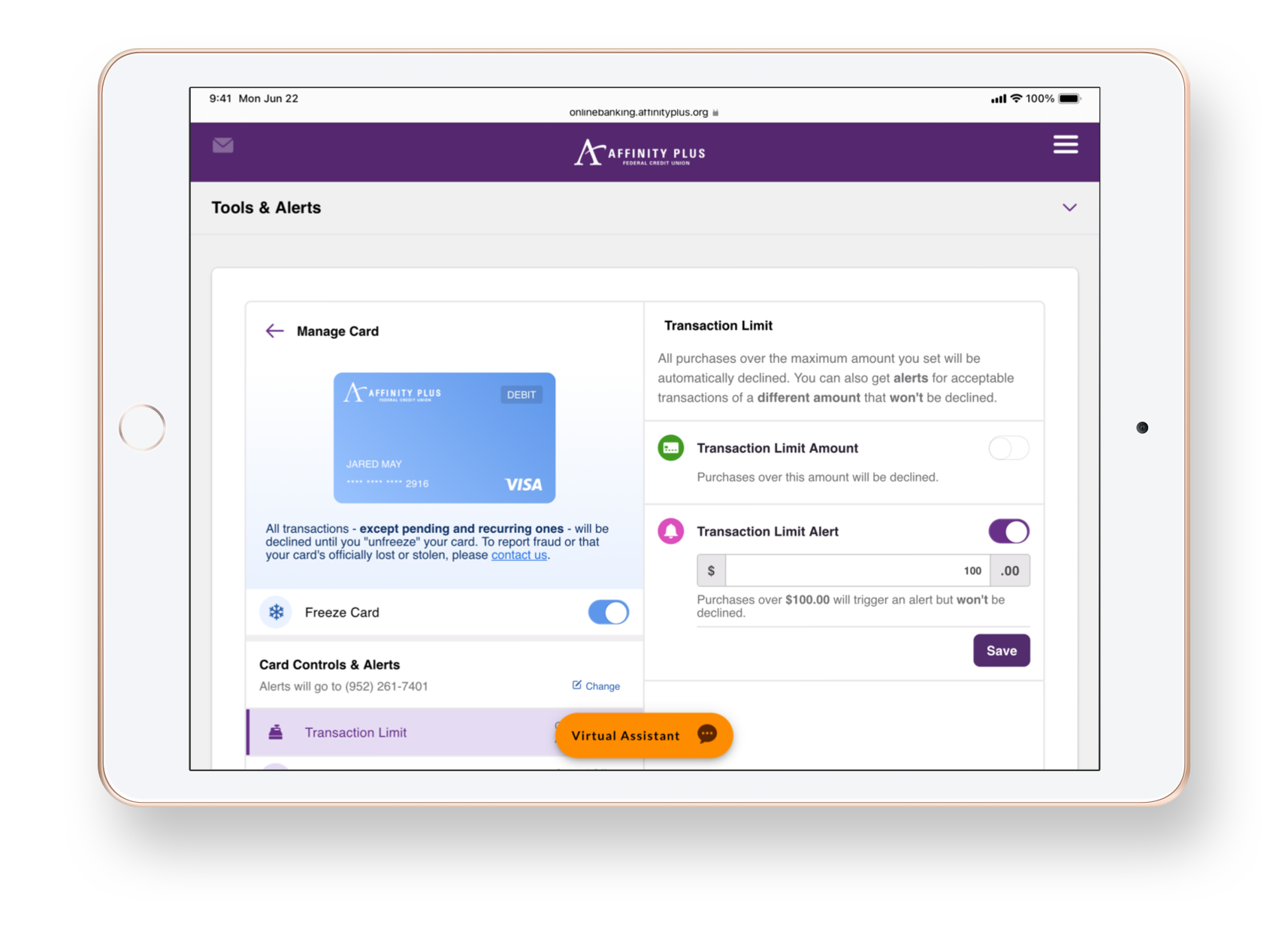
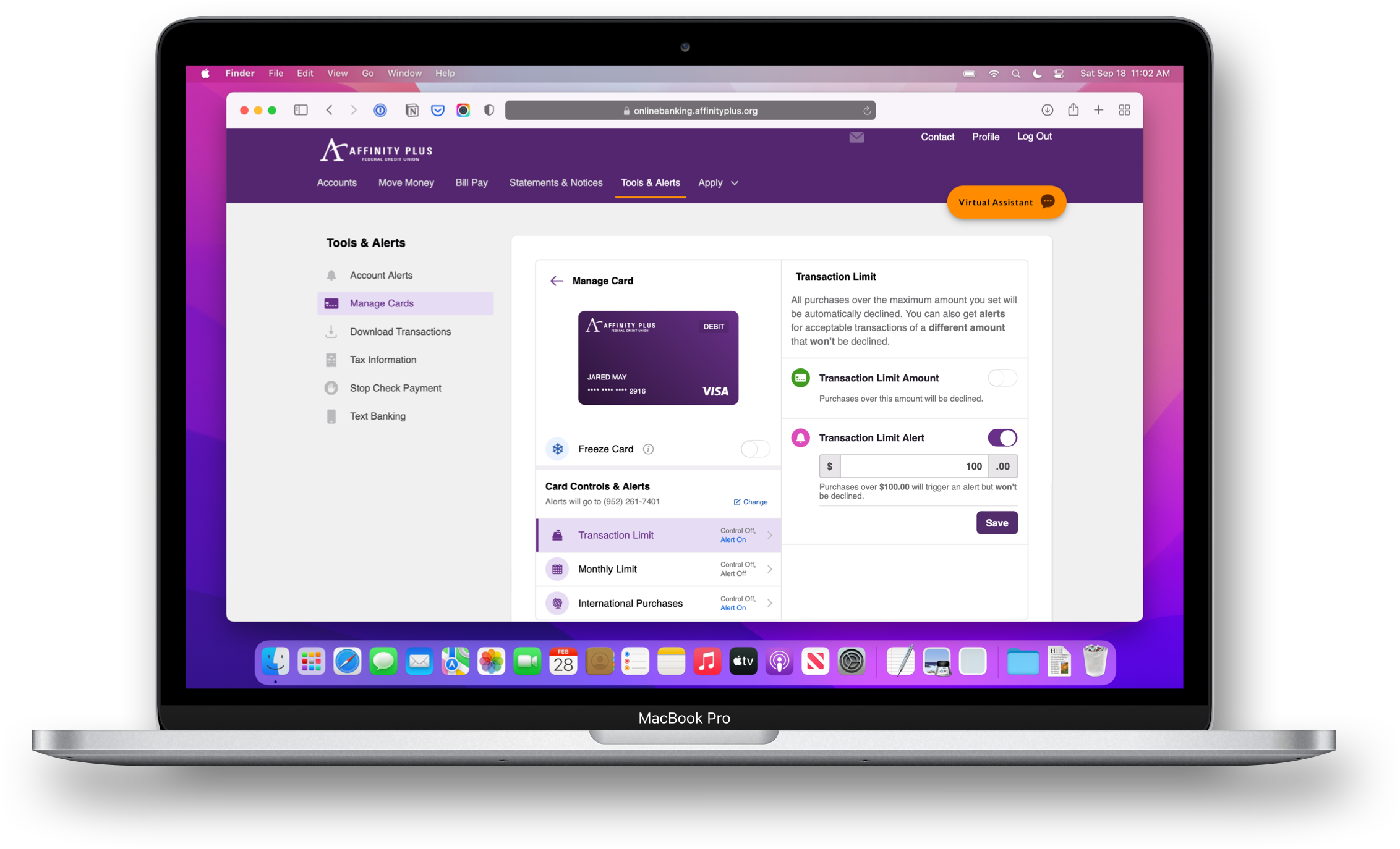
The Affinity Plus team and I launched the first version of the new app with the ability to freeze and unfreeze credit cards. That was about as much self-service control members had available through mobile banking. By adding the new card controls and alerts service, the new APIs enabled us to bring the same functionality to debit cards as well. The new service also allowed us to add controls for members to automatically decline certain charges, set spending limits, and get instant transaction notifications. I led the internal design team and our external partners in designing the user experience for the new card controls and alerts.
Action
To kick off the project, I facilitated a design studio workshop early on, inviting designers, developers, copywriters, and project managers to collaborate and sketch out possible solutions. This joint creation session sparked excellent discussions about how best to introduce the new functionality to our digital products. It also allowed the team to focus on the users’ journey to access the controls.


Going beyond the first draft
Knowing users might be in a high-stress situation when accessing this feature, it needed to be easy for them to access quickly, and it didn’t leave room for me to gamble on a solution that was “good enough.” I advocated for getting our ideas into our users’ hands early before we risked heading too far down the wrong path and developing the wrong solution. Taking our best ideas from the creative session, I mocked up key screens and created a simple prototype.


Putting assumptions to the test
Sitting down with users and watching them navigate the prototype tested my team’s assumptions and helped us correct steps users found confusing.
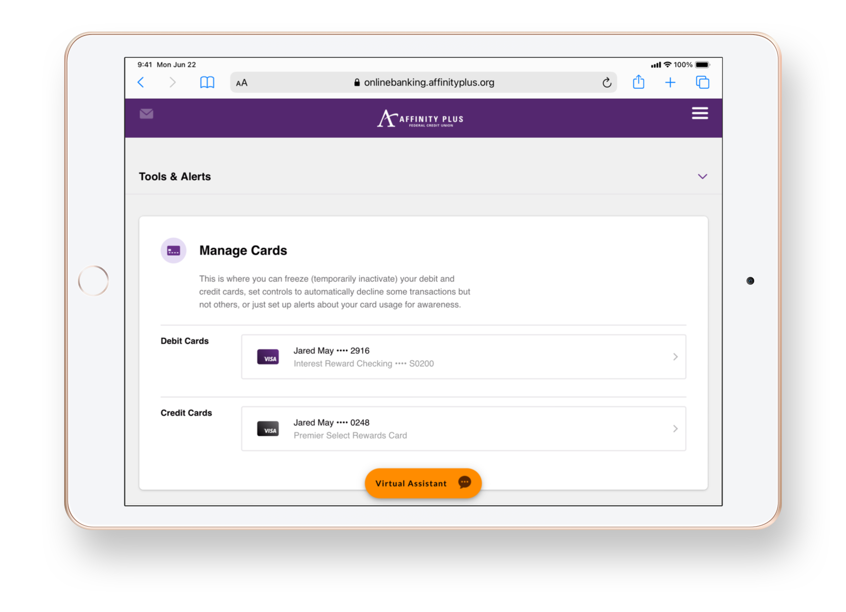
My biggest takeaway from testing was discovering that there wasn’t just one optimal journey but two valid paths. Observing an even 50/50 split, half of our participants expected to go through the account associated with their card, and the other half went looking for a list of all their cards in the “More” tab. This revelation led me to design a poly hierarchal solution to accommodate both mental models.

A mobile-first approach
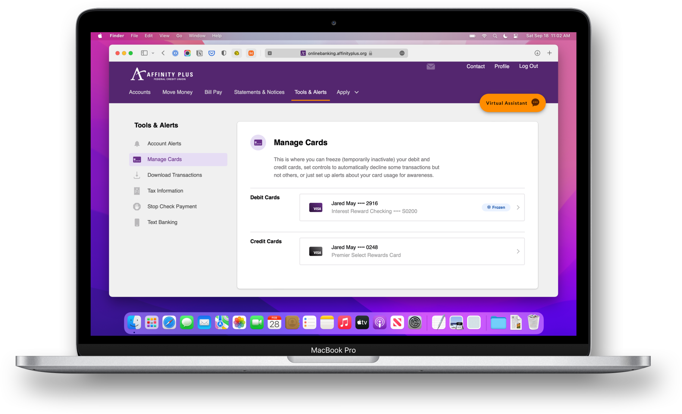
I began by designing mobile-first since the mobile journey is the quickest route for members to access their accounts and the device with them the most. Once the team and I were confident with the mobile solution, I translated our approach to the web. While designing the cross-platform experience, I maintained consistency between experiences to help members build familiarity when accessing these tools on their different devices.

I created designs for digital cards that match their physical counterparts to help members build familiarity and quickly identify their cards.

Collaborating with the development teams, I created a guide for UI elements and their states.
Facilitating cross-team collaboration
Throughout the project, I implemented an activity called Putting the Work on the Walls. With each iteration, I would print out and hang up new versions of the designs where everyone could see them. This technique enabled the team and me to “zoom out“ to see the entire journey and walk stakeholders and other team members through the flow. Sharing the work this way with stakeholders and subject matter experts helped them participate in the design process. This approach also served to document the history of changes based on what I discovered through testing. And it had the extended benefit of socializing our work to the rest of the organization by making it visible to everyone.
Results
After going live with Card Controls, we received glowing feedback from the project stakeholders. They reported a reduction in reissued cards, and saw immediate engagement with members setting controls and alerts for their cards. Reviewing the project’s success, the stakeholders were excited to work with my design team again and seek our expertise early on when they had a problem they needed help solving. Their reaction was a big win for me and my team since we were still new to an organization with little experience working with a dedicated user experience design practice. Through this project, I demonstrated our capability to be strategic partners and contribute value to our members’ banking experience.